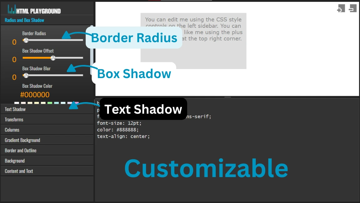
11. Customizable Border Radius, Box Shadow, and Text Shadow
Function: Allows users to adjust element shapes and shadow effects for a unique appearance.
How to Use:
- Navigate to the border or shadow customization tool.
- Use sliders or input fields to adjust settings like radius and shadow depth.
- Preview changes in real time.
border-radius: 15px;
box-shadow: 5px 5px 10px rgba(0,0,0,0.5);
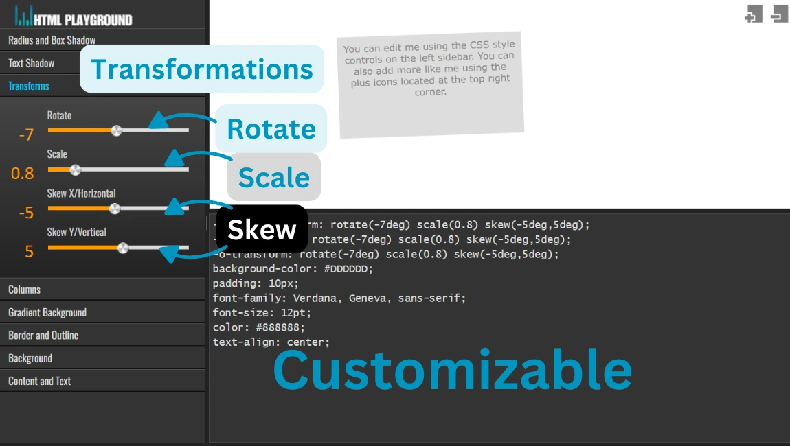
12. Transformations: Rotate, Scale, and Skew
Function: Enables users to transform elements by rotating, scaling, or skewing them.
How to Use:
- Select the transformation type (e.g., rotate, scale).
- Input values or use sliders to adjust.
- Observe changes in the preview.
transform: rotate(45deg) scale(1.2) skewX(10deg);
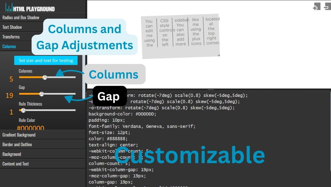
13. Columns and Gap Adjustments
Function: Configures layouts by defining columns and gaps between them.
How to Use:
- Specify the number of columns.
- Adjust the gap size using the controls.
- Apply and preview the layout.
grid-template-columns: repeat(3, 1fr);
column-gap: 20px;
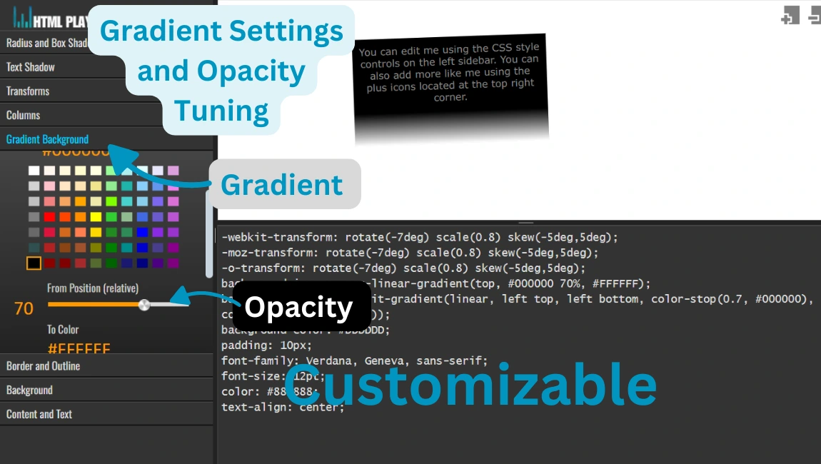
14. Gradient Settings and Opacity Tuning
Function: Allows applying gradient backgrounds and adjusting transparency.
How to Use:
- Select the gradient type and colors.
- Adjust positions and add transparency if needed.
- Preview the results in real time.
background: linear-gradient(to right, red, yellow);
opacity: 0.8;
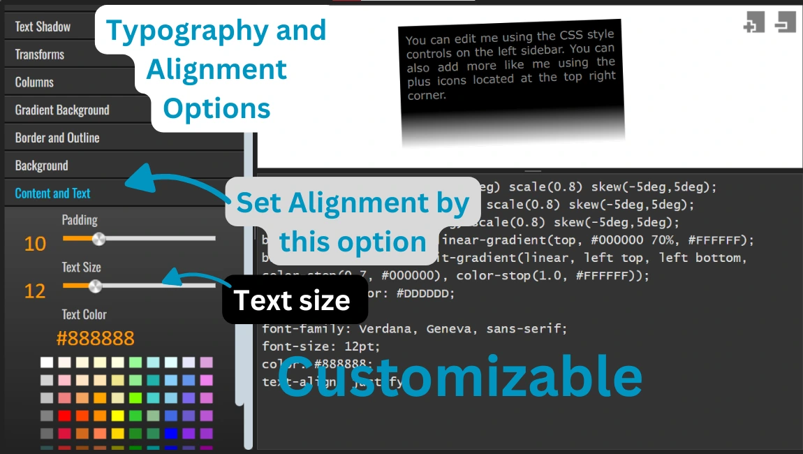
15. Typography and Alignment Options
Function: Customizes text properties like color, size, alignment, and padding.
How to Use:
- Select a text element to style.
- Adjust properties such as font size and alignment.
- Preview and refine the styling.
font-size: 18px;
text-align: center;
color: #333;
padding: 10px;